Tuesday, December 20, 2011

On Hold…

As much as I enjoy doing blog designs for others, it does take up a chunk of my time. Life at the moment has been full and overflowing and to better focus my time, I need to put things here on ‘hold’ for a bit.

When I am ready to accept new design orders, I’ll be sure to let you all know. Thanks so much for checking in!

Tuesday, June 21, 2011

The Architect and the Artist ~ Blog Design

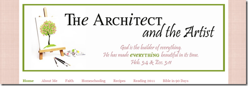
Debbie from The Architect and the Artist had an idea of how she wanted her design to look so we set off in search of some graphics that would fit in with her ideas. Fotolia turned out to be a great help and we merged a few graphics together for the header image of a tree on an easel.

Using colors from the header image, I pulled together the rest of the blog colors, focusing on pinks and greens.

image

I absolutely LOVE the blog sidebar buttons using the paintbrushes from the header image…

Photobucket


And the cute sidebar button too!

Architect and the Artist

Visit The Architect and the Artist to see the changes up close. Thanks so much, Debbie for letting me re-do your blog!

Friday, June 17, 2011

2:1 Conference ~ Website Graphics

Before I started on her personal blog makeover, Cheryl from Somewhat Crunchy asked me to put together some graphics for the 2:1 Conference ~ a homeschoool mom’s blogging conference.

image

Along with the header for the website, I also put together a variety of buttons for both attendees and speakers:

2 1 Conference Button copy   2 1 Conference Button I'm Going   2 1 Conference Button Official Sponsor   2 1 Conference Button Speaker         

2 1 Logo Button

The 2:1 Conference will be held in Northern VA from April 27-29th. You can find out more about the conference on the 2:1 Conference website, including a list of speakers and sponsors. I’m excited to be joining the team of speakers!

Friday, April 29, 2011

Somewhat Crunchy ~ Blog Makeover

Cheryl at Somewhat Crunchy wanted a simple blog makeover ~ soft graphics and easy fonts. We found a great dandelion graphic from Fotolia and I went to work on the header and buttons.

I found a great {free} background to use in the Blogger templates and we matched up font colors to go along with the new colors in her headers. We kept her current blogger template and just added in a new header and a new button along with the updated background.

image

Her new blog button is simple, but cute! Cheryl also has sponsors on her site, so we put together a simple button as a ‘placeholder’ for any empty sponsor spots.

image  image 

Simple, yet gorgeous!! Love the new look!

Font used: CK Becky {free font}

Monday, April 25, 2011

Adventures in Mommydom ~ Blog Makeover

I met Ticia from Adventures in Mommydom through blogging and have been participating in her Science Sunday posts for some time, so I was VERY excited when she asked me to do a makeover on her blog!!

We looked around for graphics for a bit and finally found a super cute clip art set from MyGrafico called Cute Heros and went from there! Here’s a look at some of her new graphics.

Header
image

Sidebar Titles
image

Blog Buttons {are they not CUTE??!}

Adventures in Mommydom Science Sunday

And a header for her Science Sunday landing page ~ I absolutely love it!!

image

Shhhh!! Don’t tell, but this was one of the MOST fun redesigns that I’ve done. I fully enjoyed each step of this process and seeing the end result {and other’s reactions} was great! Thanks so much, Ticia for letting me work on your blog!!

Thursday, April 21, 2011

Blog, She Wrote ~ Blog Makeover

Heather from Blog, She Wrote wanted a full makeover for her site. She wanted to have the graphics and text with the ‘feel’ of the old Murder, She Wrote show. I absolutely LOVE the typewriter we found and the colors she picked to go along too.

image

For the sidebar titles we just did something simple, but matching the header…

image

Didn’t her blog button turn out cute?

image

Thanks so much, Heather! I had much fun working with you and love the new look! Be sure to pop over her way and say hi!

Wednesday, January 12, 2011

The Homeschool Village ~ Header Update

Stef from The Homeschool Village asked me to update their website header…'slim’ it down a bit and add in the site’s theme verse, 1 Thessalonians 5:11. She wanted to keep the familiar graphic of the village in the header too, so that the theme from the prior header carried over.

Here is the finished result:

image

LOVE it!! Thanks for letting me help freshen it up!